


Oct 18, 2024
Hi everyone - I've been sharing more of my sketchbooks, notebooks & art journals (scans, process videos and photo diaries) over on my Patreon page. You can find me here if you're interested: Suhaylah H. :)
seen from Latvia

seen from Russia

seen from Pakistan

seen from United States

seen from Italy

seen from Italy
seen from Chile

seen from Maldives

seen from Germany

seen from Russia

seen from United States

seen from Germany
seen from Argentina

seen from France
seen from United States

seen from Greece

seen from Türkiye
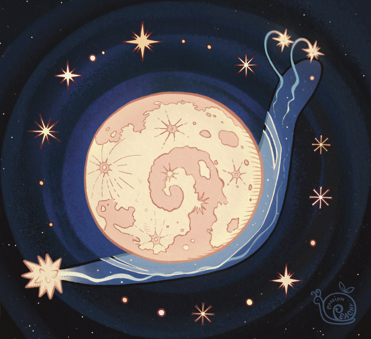
seen from Belgium

seen from France

seen from Malaysia
Hi everyone - I've been sharing more of my sketchbooks, notebooks & art journals (scans, process videos and photo diaries) over on my Patreon page. You can find me here if you're interested: Suhaylah H. :)

Cuadernos de Artista (I y II)
Quedaron arriba la digitalización de mis dos cuadernos de artista de mi obra "¿Cómo una vida puede traspasar fronteras?", para que puedas hojearlos y conocer cómo fue este hermoso y a ratos caótico proceso. Enlaces acá: Cuaderno de Artista I Cuaderno de Artista II
Para mí son una fuente indispensable de información y una tremenda herramienta de trabajo. Larga vida a los cuadernos 📖✨

Book Brief - Concept 1: The Breaking Ice
Inspiration:
When initially preparing for this brief, I remember an image coming up on my timeline. A crack in an ice sheet was shown, with the heading ‘Iceberg the size of Bedfordshire breaks off the Antarctic’. It was quite impactful a thought, that even while reading this book and doing this project, the effects of climate change were very real, very present, and very unavoidable.
In the book, Wallace-Wells references ‘dreamtime’ which is the ‘experience of encountering, in the present moment, an out-of-time past’. He goes on to liken this to watching footage of an iceberg collapsing, ‘a feeling of history happening all at once’. He also discusses the ‘climate’s kaleidoscope’, and the idea that we as humans can ‘be mesmerized by the threat directly in front of us without ever perceiving it clearly.
Therefore, I wanted to use imagery that represented this phenomenon. This idea that such a grand and frightening event is happening in-front of our eyes. That we are seeing the world breaking day by day. Visually, I wanted to use photography that linked to that original image of the iceberg and had the type closely interacting. I wanted there to be a sense that the typography elements would be part of the image, rather than layered on top.
I was inspired by book covers such as the ones below. I really enjoyed that although the photography itself is bold, the typography clearly compliments it, rather than distracting from it, or acting as an afterthought.
Experiments:
To link back to the iceberg I had two trains of thought. One was the destruction, the breaking apart, and ‘cracking’ of our climate, and the other was the heat, ever rising that caused these events to happen.
Initially I looked at how I could work with fire and burning - not only because this linked to the heating of the earth also the patterns created from the flames actually created a crack-like appearance. Layering each of the burnt pieces on top of one another created some depth which I enjoyed.
Although I was a fan of the visual, I wasn’t sure if it conveyed what I wanted it to. I did however like the space I had created with the empty parts of the cover - and decided that was a feature I wanted to keep.
I also tried creating my own iceberg crack from polystyrene. I experimented with how this would work with some text as well, trying text directly on the image and superimposed on top using digital methods. I think the thickness of the polystyrene helped bring a depth to the image. I was happy with this as the backdrop to the cover.
When playing with type interactions, I wanted to the crack in the polystyrene to manipulate the types orientations. I think the type being straight worked in some aspects but it felt more fitting to the image when the words were slanted to an extent.
Reflection:
The final piece I ended up using something directly from making. I thought that it well reflected my concept, and was a clear link to the book. I liked that the imagery was bold, but it was abstract enough to let the viewer come to their own conclusions about what the crack was representing. Some may see the physical, reality of the cracking ice, some may see the breaking of our world as we know it. It may have been improved by being wrapped around the whole spine and incorporating the imagery with the type of the back as well. This might have allowed for the copy on the back to also play with the imagery, and there could be some empty space filled with a visual.
The title typeface was cutout text - with a font style based on sans-serif ‘Intro Condensed’ font. The type is bold against the white of the background, a nice contrast that makes it stand out. The placement of the type was important to me, and I felt I was able to achieve what I wanted. The letters are orientated with the crack on the cover, and are hanging over parts of the broken 'ice'. This represents the Earth being on the edge, being on the brink of falling. The supplementary copy uses the much softer, but still clear, sans-serif ‘HK Grotesk’ font.
As a cover itself, I feel that it is a bold statement on the cover. It links to the book as it represents a warning, a very black and white 'this is happening, here it is'.
Concept 3: Alarming Data
Inspiration
For this cover, I wanted to represent the books outpouring of data, facts and figures that had been collated and carefully researched. The book was originally based on an article for the New York magazine and was expanded to become a non-fiction book. The book isn’t a story, it’s an essay, a collection of data, put together in one book to show exactly how much evidence there is that climate change is happening, and fast.
My original ideas on this were based around incorporating data on climate change as part of the imagery. I found a few examples of data visualisation that had been used by NOAA AND NASA and decided to use these as the jumping off point for conception.
In terms of design style, I was drawn to the works of designers like Roy Cranston.
I really liked the way he played with the typography shapes and sizes, changing the paths the type was on to compliment the shapes in the visual. I wanted to incorporate the shapes of the data in the cover and relate it to the typography.
Experiments
I began experimenting with the different graph shapes that might work for the cover. The line graph was the most commonly used in my research of this data, although some featured bar graphs and other representations. When playing about with the different orientations, I felt like the lines were the the ones I wanted to use.
I felt pretty strongly about representing real data on the cover, as much as the inside uses facts and figures. I took the shapes of the lines from real data on the rising levels of CO2, sea-levels and global temperature.
After I had sketched out these graphs, I looked at the different ways the type could interact with them.
I tried creating some lettering that might work alongside the graph data lines as well. I initially thought it would be good to create letters that looked like the ocean current visualisations. I used an old paintbrush and ink to get the line effect I wanted. I was happy with the end result, but thought overall it seemed too playful to suit the cover of this book.
I also looked at using charcoal and paint to create some more textured letters. I liked this but felt with the rigidity and clean lines of the data I wanted to represent, it felt disjointed. Taking a look at the style I wanted to emulate, I decided it might be better to use a sans-serif typeface.
After playing with the different ways of layering the line graphs, I took the patterns into illustrator and starting working with the selected type face. I enjoyed playing about with the blending tool in illustrator to create something visually impactful, but I felt it took away from my original concept, and although interesting to look at, it was hard to interpret what was happening. I decided as well that instead of creating shape with the title itself, which I wanted to be bold and clear - I used quotes from the book relating to the data to represent.
For the background, I tried a variety of different textures. I thought a ground texture might work to loop it back to this idea of ‘Earth’ but similarly to the charcoal, it didn’t feel like it connected as well. I instead went back to the graph paper I used originally. I soaked it in water to make the grid lines bleed a little, to give just a hint of the chaotic events suggested in the book.
Reflection
My final piece was something I was really proud of. I wanted to create something that didn’t directly link to climate change events itself, but much like the book alluded to the overwhelming data that alerts us to a need for intervention. The type I choose was the sans-serif Bhanschrift which, although dark and bold, was written in lowercase. I felt that this was better than all uppercase because the book does not feel like it is shouting ‘This is your fault!’ so much as it is stating matter of factly ‘We need to do something” - clear and concise. I paired this with the ‘Letter Gothic Standard’. The style seemed to go well with the data theme, having a slight monospace feel as well as looking like traditional typewriter font.
By using the quote from the book to sit along the lines of information from NASA’s website, I felt I was able to create something visually intriguing, representative of the book, as well as snippet of what’s inside. Using the background of gridlines keeps in theme, but by adding subtle hints of colour and bleeding to the ink, kept the imagery from looking flat, and also linked to the colour palette of other data visualisations.
I think although I choose to do with a font, I would have been interested to find a lettering style that suited the cover. The way the lines of data are drawn may have allowed for a hand written type, although having them different creates a contrast.

DAY SIX 🐦⬛⛰️🌪️
veeeery loose & unfinished one today
tryna nail down a design for a new star wars oc. and by new i just mean a revamp of my very first star wars oc. oh, what’s that? i’m falling back into my sequel era?? whoops ig
anyways i want her to be very willowy but very feral. kinda where-the-crawdads-sing-esque. clearly idk what to do w her hair. trying to lean away from my usual curly/short/choppy
whatever i’m dozing off as i type this so i’ll figure her out later


Sketchbook Process Talented illustrator friend Ed Cheverton was inquiring about my process for a talk he's giving on sketchbooks. Something I'd never properly considered until now. Below you'll find my attempt in breaking it down.
'I guess you could say that my use of Sketchbooks is some what schizophrenic but to apply order to their function I would say it comes down to immediacy. And when I say Immediacy I mean how quickly I am thinking or need to think about something. I'm primarily a note maker. It's more a process of applying structure to thought, organising random words into cohesive sentences but I also sketch from time to time, nowadays this is mostly a digital process. Here are the formats I use and their divisions.
1. Immediate - Notes made on the day of an event, whether that's a meeting or a stack of to dos.
Textedit
Sketchbook
2. Projects - Projects are usually divided up into a stacks of sheets, mostly sketches and notes. It's easier for me to get everything out and apply some curation of thought that way
Loose sheets
Sketchbook
3. Thoughts - For the cliche coffee and cafe moments, in transit, on holiday, etc.
Sketchbook
4. Public Play - Digital note-taking, this area is mostly practice and play, a chronological documentation of aesthetic ideas, concepts..
Blog