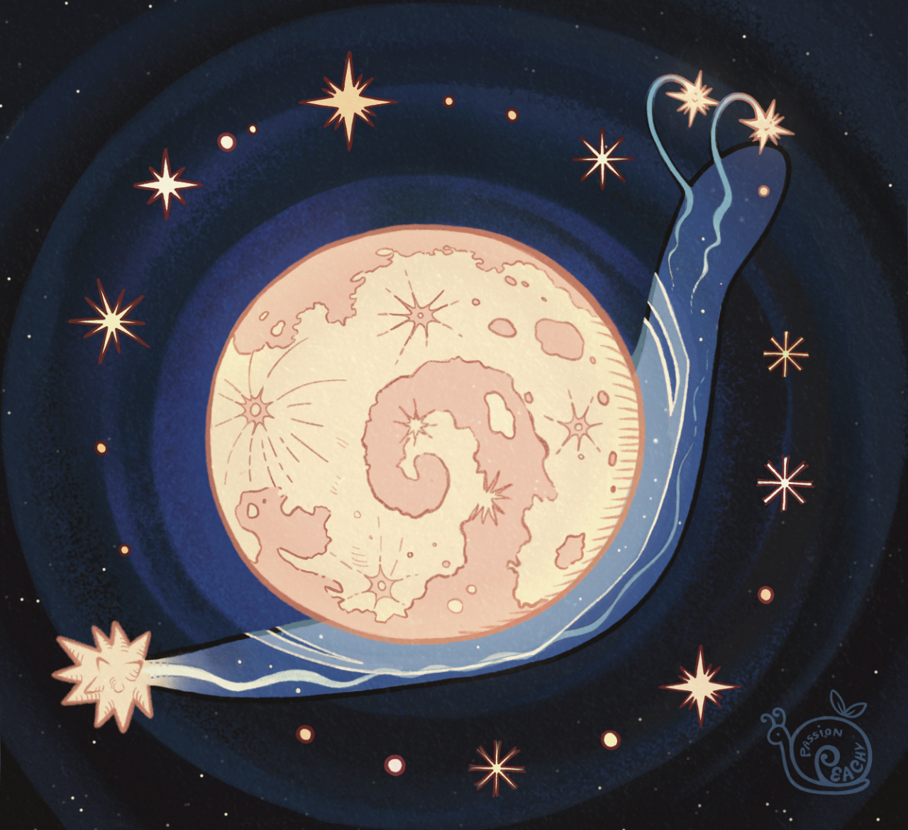
Anyone got room for yet another October Prompt List? 😉
I really wasn’t feeling the Official Inktober Prompt List this year & deeply miss the Obscutober lists nikolas_tower used to post over on Instagram, so I decided to break from tradition even more than I usually do & make my own! ✨
The main idea is each prompt is an Obscure Word, but I did get a little choosy & try to put a bit of my own spin on it!
Click the "Keep Reading" and we'll talk more about the details + Definitions if you need them. ✨
⭐️ Like My Art and Want to see more of it? Here's All My Links! ⭐️
----------
Before I get into my usual long-winded description, if you want to actually follow this prompt list—Or the Lite or Weekly version—here's what you need to know:
Here's the "Official" Definition list so you don't have to spend time looking up the words yourself if you don't want to...But also, if you do want to, feel free! The "official" definitions are intended as a time-saving guideline!
The list is open to all mediums! "Typical" visual art (Digital or Traditional), Literature, Sculpture, Crafts, Coloring Pages—whatever you want!
The word itself does not have to be directly included/related to what you make; You can just take inspiration from the way it sounds or looks, or something the sticks out to you in the definition, etc.
If a word or two doesn't work for you for various reasons, feel free to swap-in a different word—Either another "obscure" word of your choosing, or a word from another prompt list that you like better.
I've provided "Lite" and Weekly versions of the list in case the full 31 is too much, but you can pick-and-choose words from the full list however you'd like if you're not crazy about the words I picked for the shorter versions, or if you want to shorten the list in a different way.
Tagging me is appreciated, but not required!
Remember that my views on these Month-Long Daily Challenges is that it's about the challenge of completing a certain amount of creative pieces in the time given...And that's pretty much it, so as long as you're doing that and having fun, I'm really not bothered about how you choose to follow the list! My Inktober motto has always been "work smarter, not harder," and this is no different!
----------
Well, well, Sparklers—I assume this is quite the surprise coming from me. 🤭 Both because I've been awfully quiet over the past couple of months and this is what I come back with. [And for the record, I intend to explain more about where exactly I've been in a Museletter, but I wasn't able to get it typed up and ready-to-go today; Once I get it ready I'll add the link here.]
Not that me disappearing for a while and coming back with something not necessarily expected of me is all that abnormal, but rather if you've followed me for a while, you might remember I'm not normally super-keen on everyone and their uncle's mother's brother's sister making their own Prompt Lists.
So then, Mystic, what gives? Why make your own Prompt List now?
You can thank nikolas_tower on Instagram for that, actually. 😆 Some of you might also remember that I follow his Obscutober list in October 2021, and I've also swapped in an Obscutober word a couple of times when one of the "official" Inktober words didn't work for me.
I've explained before how much I love the Obscutober concept to its core, so I won't re-hash all of that here. The important part is that I do love it, but to my great sadness, 2022 only got an abbreviated Obscutober list (2 words per week), 2023 didn't get an Obscutober list at all (though I didn't really need one for 2023 because I was busy enough as it was following two other prompt lists at once) and considering just how close we're getting now, I really sincerely doubt Nikolas has/had plans for a 2024 one.
Add to that: I was not super jazzed about the official Inktober prompt list for this year. Now, don't get me wrong—I'm normally not thrilled with every single word on the list (and if you've followed my Inktobers' past, you know I say as much during the month!), but I'm not sure I've ever felt quite so unenthusiastic about the whole list before.
Additionally still, some of you might remember I did talk a little bit last year about some...struggles I supposed is the closest word, that I've had with the past couple of Inktobers I've done. And generally, I've had some ideas for really shaking up the way I handle October for the past couple of years.
While, granted, my main "shake-up" idea is totally unrelated even to this list and I never seem to be able to get the necessary prep work it would require done in time, I think the main takeaway is a I've had a low-grade yearning to do something different...but I do still want to stick to my "tradition" of handling Inktober unconventionally.
So in the end, it kinda just made sense to at least try making my own Obscutober-style list this year. It's something different and I've missed the Obscutober lists, so why not?
Worth noting that I did try to put just a little of my own spin on it in my choice of words. While already I did try to stay away from words Nikolas already used for all 4 of his Obscutobers, I also had a couple of "rules" with the words I picked:
No words that are "Obscure" purely because they're not English/aren't found in English dictionaries. For example, "Lunette" is a French word, but it appears in English dictionaries with a definition that's more than just "the French word for..."
The word must have a definition that's relatively easy to find and/or appears in well-established English Dictionaries like Dictionary.com or Merriam-Webster. This rule exists because I noticed pretty quickly a lot of "aesthetic" definition images on Pinterest either don't turn up any other reliable results that a word even exists, or the word may exist but the Pinterest definition is straight-up wrong.
No overly gross/medical/NSFW words. (This wasn't a problem with any of Nikolas' Obscutober picks, this is just a personal preference that did shape my research a bit.)
One of my problems with the Inktober list for this year is too many words feel like synonyms/too closely related, so I wanted to avoid that. A couple of words are still kind of close in the end, like "Vitrine" and "Hyaline" or "Escutcheon" and "Orphrey, but they're still more different from each other than some words that I considered and ultimately turned down. [For example, I considered "Lambent" and "Clinquant" but decided they were too close in meaning to "Scintillate."]
Likewise, aside from the theme of being Obscure, I tried not to lean to heavily on words that fit a particular theme or idea
I tried not to pick "obscure" words that have become decently well-known or popular because they're obscure. The best example is "Aglet" wasn't even considered because it's been mentioned in multiple TV shows that I know of. "Scintillate" might push that boundary a little, but it is one of my personal favorites.
I also tried to pick words that had a little variety in definition length and not pick too many that had really short definitions, which ties into my next point...
More abstractly, I tried to pick words that feel like they both lend themselves to a really solid image but also leave room for interpretation of that image. Historically I've had problems with Inktober words feeling too much like they really only fit one specific interpretation of the word or they only have so many ways to represent the idea. And on the flip side, some of Nikolas' Obscutober picks (at least when I participated in 2021) felt a little too abstract at times. Ultimately, this feeling is probably highly subjective, but I tried my best to find the right balance anyway.
While not perfectly balanced, I did try not to lean too heavily on one type of word, as in Adjectives/Nouns/Verbs. There are still less verbs overall because it was just harder to find verbs that fit what I wanted, but if I hadn't consciously paid attention there probably would've only been 1-2 verbs and like 20 adjectives.
Not really related to adding "my own spin," but also worth noting that it was also important to me to provide "Lite" and Weekly versions of the list the way that Nikolas did for Obscutober II to make it easier for people that just don't have one-thing-every-single-day kind of time to feel welcome to still participate in some way. As stated in the description for those, you can just jump around the list however you like, but I know sometimes it's just easier if someone already lays things out that way for you instead of having to remember to leave things out and such.
And then for the visual list design, I did a mixture of Nikolas' Obscutober list style and my own more typical branding elements, which ended up working out much better than I expected; I wanted the "spirit" of the list to be recognizable to fans of Nikolas' lists without being an exact copy/looking too much like I was trying to "pretend" to be him or something, and I think I landed in a pretty good place. [And in case anyone is wondering, yes I did use my own template to make the list!]
I do have to admit to you Sparklers though that despite going through all that trouble, I'm actually still not 100% sure I'll be following the list myself. 😅 I've gone back and forth over how exactly I want to handle October at all this year so much...I definitely want to (and intend to!) do a Daily Challenge, especially given how spotty my uploads have been over the last year, but I just can't seem to settle on one full-fledged plan that I'm completely satisfied with.
I do have one potential idea I'm considering that already has a very specific alternate list, but pretty much all of my other ideas would normally use the official Inktober list, and so since that list isn't on the table for me this year, and it's really looking like DeviantArt isn't doing Drawtober again this year—Which I find incredibly sad, by the way!—I need another list on-hand that I know I can use and be reasonably happy with.
And for the record, I'm being intentionally coy about that one specific idea and not sharing that list because it's highly specific and if I do decide to go that route in some way, I'd like the main idea to be a least a little bit of a surprise.
But even if I don't use this list myself, I thought at least a few other people might enjoy giving it a try. After all, I wasn't the only one that enjoyed Nikolas' Obscutobers—I originally found out about them through another person entirely. So maybe a few other people are feeling that Obscutober void, or maybe you're just a big Word Nerd™ like me, or maybe you just want something that's a little different still from a lot of the more typical alternative prompt lists that have been floating around.
So, whatever the case, here the list is (and the Lite and Weekly versions, too); Let us all do with them what we will! 😉
Before I go, I will offer an apology to anyone who's disappointed or frustrated that I'm posting the list so close to time to use it—Believe me, if I'd been 100% sure I wanted to make it in the first place sooner, I would have gotten it out much sooner, too! But I'm doing the best I still can by getting out with this very tiny 2-day cushion instead of just dropping it right on the 1st. If the list turns out to be something you Sparklers want to see again next year, I promise I'll do my best to get it out with a lot more advance notice next time!
With that, there are still two days left in September and as semi-implied already, I still have a ton to do to be anything close to ready for October, so I'll leave you Sparklers to the list and your own October plans, whatever they may be; Hope to see you all again hopefully very, very soon...! 🤗
TL;DR:
I haven't been around in a while primarily because I've been dealing with a lot of burnout, then a Reddit suspension, and then the emotional fallout from that suspension. But I am hoping to have turned something of a corner and now be working to get back into the swing of things. If you're interested in the longer version of this story and a look at some other things I've been working on while I was away, I've got a blog post you can read [here on Tumblr, DeviantArt, or my Ko-fi].
This artwork, likewise, is my "comeback piece" and here are what I have deemed the important highlights:
I started with this coloring page from DestinyBlue as a base and tweaked it to be "more me," though the color palette and lighting were also heavily inspired by Blue's other artworks
Except for the wings, star, and paint bucket which were inspired by Camilla d'Errico's style
I mostly used Ohuhu Honolulu markers, but the wings, star and paint in the bucket specifically are a mixture of Ohuhu's Nahuku paint pens and Languo 0.6 mm gel pens
There were several thumbnails/mini versions colored for trial and error because I am not used to this kind of dramatic lighting with traditional media 😂 Don't think I got any of this right on the first try because I SUPER did not!
Click "Keep Reading" for the full/long version of the story. ✨
----------
And now for the longer explanation of the artwork itself for those interested:
After what feels like an eternity away, I wanted to "come back with a bang," of sorts. And well, I hope this artwork looks like "a bang" to you all because it's what I came up with! 😂
This isn't quite my usual "artwork flavor" for a few reasons, aside from me wanting "a bang" as mentioned. Namely, instead of starting from scratch, I started with this coloring page from DestinyBlue and modified it to be "more me" both literally and just in terms of the art style. (And I changed the halo to a six-point star mostly because I didn't want to accidentally make it look like a memorial post or something when I post this in other places.)
I have always loved Blue's work and I did think I might save some time doing that (and maybe it did but I ended up taking way too long on this anyway for other reasons 🫣) but my main motivation for that decision was actually how involved with the Coloring Community I became while I was away (more details on the specifics in that blogpost I mentioned).
And for what it's worth, going forward I think incorporating more coloring/coloring community content into what I do would be good for me, I just have to find the right balance and rhythm to it.
Anyway, after I had the page lines to my liking, I printed it out—including a dozen smaller versions on cheap cardstock, some of which you can see peaking in on the corners! I wanted ample opportunity to practice to hopefully avoid disaster on the final version, and suffice to say I did in fact end up really needing the practice for what I wanted to achieve. 😅 [And if you're really interested, my Ko-fi Members have access to the full array of thumbnails.]
Since the recent resurgence of adult coloring has had a focus on using various techniques to do a lot with simple, "cozy" pages, I wanted to lean into that idea. That's not my typical preference for coloring pages (as I think I've explained somewhere before I like to keep things pretty basic and save the complicated stuff for my own art) but I did want a bang after all, and it felt right to sort of play tribute to the community that gave me something more positive to focus on instead of how crummy I was feeling otherwise (again, more details about that in the blogpost).
In hindsight it probably would have been faster to pick a well-established technique/trend for the coloring, and I did consider that. But I more or less stuck with my instincts because I was a little worried about "blending in too much," if that makes sense.
And my first instinct, more or less, was to take inspiration from a lovely palette that pops up in Blue's other artworks a lot. It's a lovely palette anyway, but I also thought it would be a good way to keep the palette more limited and still come out with something rather striking if handled correctly.
That is also however where "needing" two pages of practice thumbnails came in because this is not the kind of approach I'm used to taking, especially with traditional media and in tight spaces. 😅 But I really wanted to keep this project as traditional as possible, and in particular I wanted Ohuhu markers to be more or less the focus since one of the starting goals was to be able to make a proper "I'm back," post on Reddit and r/Ohuhu was my most active place before the suspension.
So the thumbnails were mostly focused on first getting the "correct" gradient of markers (+ pencils tp enhance the texture in the hair), and then finding my rhythm for exactly how to use them—Placing shadows, speed between blends and color placement, focusing on one color or the other in certain spots to create at least some illusion of surfaces that would be different colors under normal lighting (keep the skin lighter than the hair and dress, for example), and so on. I did have DestinyBlue's original artwork to give me some ideas on the shadows, but there was still quite a lot that I had to essentially just "feel" my way through.
I did eventually get "comfortable enough" to tackle coloring the girl on the larger, nicer printout, and fortunately it went well!... And then hit a little bit of a wall when I realized I had given exactly 0 thought to the background and had only vague ideas at best for what to do with the wings. 🫠
Since I had such strong lighting already for the foreground, what ended up making the most sense for the background was to just keep it simple. So the darkest purple-y blue marker I was using took the lead and I used a combination of suggestive shading and separating the "wall" and "floor" by texture as best I could—I stuck with the brush tip for the floor and used the chisel tip as much as possible for the wall with no real effort to hide the blocky streaks. (And in hindsight, that might have worked better for a wall texture if I had used the chisel tip going from side-to-side inside of top-to-bottom, but oh well...)
The wings proved more problematic and aside from life things and some self-doubt getting in the way, they were probably the thing that slowed my progress down the most. And more thumbnail testing wasn't really helping. 😅
At this point, I decided to take a break and work on some other things for a bit. I didn't really want to add to how long it was already taking, but I also didn't want to try and brute-force my way through and end up feeling like I'd ruined what I had, either. 🤷♀️
I also scanned what I had as a backup in case I did end up ruining it, and later (now with fresher eyes) tried experimenting with the wings digitally. I did have to be mindful of what I can and cannot translate between digital and physical, but I think that change of format really helped.
I landed on an idea I had tried but wasn't super sure about with the traditional thumbnails: If the wings are painted anyway, why not rainbow splatter paint? The original test felt too flat and "tacked on," though, so If I was going that route, it needed some serious finessing.
And I don't fully remember how I arrived at this conclusion, but after mulling it over I thought I could try something inspired by Ccamilla Derrico's signature drippy style. Clearly this idea won me over, but it did still take some deliberation both digitally and physically to really get what I wanted. 😮💨
After more thumbnail testing, the final "mix" for the wings/paint was a white (Nahuku) paint pen base (to cover up the background marker color), mostly the Nahuku colors you see along the top with some refinement using the Languo pens on the right, then an attempt to brighten up the colors with the additional Languo pens on the left because some of my color choices turned out more muted than I wanted. And I ended up with a few more back-and-forth layers of both Nahuku and Languo partly for color placement and blending reasons, but also because the Languo created some funky texture work I was not super successful in trying to tame. 😅
That whole process was incredibly nerve-wracking and while I'm not 100% sold on how the color placement turned out on the paint bucket and some more minor things, I was ultimately kind of relieved that it came out as well as it did! 🙌 Especially since, with that part mostly to my satisfaction, that left me with largely just finishing touches.
I used a blue hard-brush fineliner to touch up some edges and go over parts of the printed lines that were looking just a tad more grey than a true black, white Languo for the shine in the eyes, and then the thing I was the least sure about—Taking Languo pens to most of the lines for the hair instead of leaving them black.
That was something else I tested digitally and it looked really good there, but it didn't turn out as well in some of the thumbnail tests, so I was torn, particularly on the ones closer to the face. But you can see that in the end I just went for it anyway, and while it's not as punchy as the digital version, I still think it was the right move in the end. 👍
And after alllll of that, one final challenge awaited me: Capturing the fruits of my labor to share. (Well, and figuring out the title, but long story short, given the circumstances, since Blue's original art is "Paint Your Wings" and this piece is sort of a "phoenix rising from the ashes" moment for me, "Wings Repainted" is meant to be feel a bit like "Wings Restored" or "Wings Reborn" without being quite as on-the-nose about it.)
I anticipated having issues with color accuracy, but I did not anticipate that 1. I would not have the mental energy to clear the junk off my nicer scanner to mitigate this and 2. The idea of taking an actual photo with a flat-lay of (most) of the supplies I used and maybe squeezing the thumbnails in somehow too would be as appealing as it was. (Maybe since it's been so long since I've posted a traditional piece? I'm not sure.)
Suffice to say, I took the photo and then I had to do some not-insignificant fiddling with it in Photoshop to try and balance out various aspects of the lighting, the colors, the contrast, etc. And I promise I have done my level-best to get the final image you see as close to "true to life" as I am personally capable of without over-doing it. I just want you Sparklers to see as close to what I see IRL as is possible, not create "results" that would have been soooo much easier to just make digitally from the start. 😵💫
It's still slightly off, but it is much closer than where it started and if I let myself keep tweaking it, as much time as it's already taken to get to this point, the poor thing may well just never get posted, so I had to stop myself somewhere. 😅
Still! All things considered, it would be safe to say I love how it turned out, flaws and all. 🥰 I may not be happy with how long it took, but I think I was more worried I wouldn't be happy with the results than I wanted to admit, and the extra time was necessary to make sure I could live up to my own expectations.
And I won't get too far into these extra weeds, but that goes for writing this description, too, which also ended up taking WAY longer than I really wanted. 🫣 It is partly because I haven't done this in a while, but also it may not seem like it, but I really did try to condense everything down to hit the specific details I wanted to and not get too terribly bogged down with "storytelling fluff."
Which, for the record: I bother still writing these with detail at all both for the few people I know are still out there that appreciate it, but also I genuinely just can't help myself. 😂 There's usually quite a bit that went into a piece that you can't see in the final product that I'm compelled to explain and it can be helpful for Future Me if I need to remember parts of a process I haven't done in a while. And since I'm not in a position to make a video about every piece talking through the details, this is my next-best option. (Even if I often get on my own nerves trying to sort out the length...)
On that note though, I think I have finally covered everything I wanted to here. And I'm not the greatest at ending these at the best of times, let alone after such a gap, so I'll just leave you Sparklers with a reminder that you might want to check out the blogpost I mentioned at the beginning if you're still curious about where I've been, and a genuine thank you to Sparklers that have followed me for a while and continue to stick around even when I disappear for a while. 🫶
Hopefully it won't be quite as ridiculously long before you Sparklers hear from me again, but either way, take care of yourselves and stay sparkly, okay? 😉 ✨
Hey look, I am actually capable of finishing & posting something!
What can I say? Life was just too chaotic the past couple of months and something had to give. Art posts were unfortunately the easiest thing to cut. 😅
Anyway. I have managed to chip away at a few projects in between other things, and this in particular was kind of a spur-of-the-moment decision I spent most of January working on: A very basic website where you click a button (or two) and get a random assortment of Ohuhu marker colors to then use however you see fit! ✨
If you are interested in listening to me ramble about how exactly we got here, that's what the "Keep Reading" button is there for. 😉
Like My Art and Want to see more of it? Here's All My Links! ⭐️
----------
Well Sparklers, this is certainly not how I expected to start off 2025 (nor did I plan to end 2024 as silently as I did as far as art posts go), but here we are! 🤗
Quick Recap: I made a very bare-bones website that will generate palettes of randomly selected Ohuhu markers colors for you!
I've probably said this somewhere before, but it bears repeating: I've been slowly but surely chipping away at various projects behind the scenes, a couple of the bigger more involved ones being related to yes, Ohuhu markers. [And for the record, no I really didn't forget about OhuHueVember, this past November just turned out to be one of the most chaotic and busiest of my entire life, and unfortunately putting art posts on Pause was what made the most sense at the time, and then December was just naturally busy what with Christmas and Family and all.]
A few days into the New Year, while I was taking a break and scrolling social media, since I am pretty deep into the wider Ohuhu Community at this point, I saw a kind of post that I've seen a few times before: Someone asking about generating color palettes of Ohuhu markers for coloring (as in adult coloring books). Usually, the "answer" to this is to use an existing color palette generator (of which there are many) and just manually match your markers to the colors, but that's not usually as easy of a solution as people are looking for.
I think there's at least one generator out there that can tell you Copic marker (and maybe Prismacolor pencil?) matches for the colors it generates, but it hasn't quite caught up with the boom in popularity that Ohuhu has had, so instead of matching to the color itself, you'd just be trying to match to the Copic color instead, which I would argue might actually be harder to do, even with some community resources that are out there.
The point is I know in the Coloring Community, people tend to like easy solutions and there really wasn't one for this specific problem. And I've known this for a while—since the first time I saw a post asking for something like that, which was many, many months ago (maybe even a year or more), but yet for some reason this most recent, totally inconspicuous post sighting was the straw the broke the camel's back and made me finally snap:
Surely there has to be something out there were you can put in a custom list of colors and it'll randomly spit like 5 of those colors back out at you. There are all kinds of random generator tools out there, surely at least one could do something like that, couldn't it?
So down the rabbit hole I went.
There wasn't a terribly straight line that lead me here and I went back and forth to a few things a few times, so I'll just give you a list of the highlights that had the most influence in how we got to this point:
I tried just about every keyword combination I could think of for "custom palette generator," "make your own palette generator," "make random color palettes," "color randomizer," etc. Even if it wasn't terribly fancy and the absolutely barest of bones of the concept I described. No real luck there, but it's very possible I just totally missed something.
I eventually checked Flippity.net because I love their Flippity Manipulatives tool (for digital Mini-Magnets), and their "Flippity Randomizer" would have worked except it has a very strong default color palette for what the final randomizer looks like. While it still would have been totally functional otherwise, I know the strong color mistmatch could very well be a dealbreaker for some people to not want to use it at all. (And, to be fair, the final Flippity links tend to be...long and suspicious looking if you've never seen one before.)
You can use images with the Flippity Randomizer, but the thought of having to make 300+ separate small image files that would also need to include the color names and numbers directly in the image and then also put them in order in a Google Sheet sounded torturously tedious (even for me), so I filed that idea away as "Plan C" and kept looking.
Flippity did give me the idea to try looking for more generalized randomizers that could be re-purposed for what I wanted since theirs' was originally for making sentences. Through that, I finally stumbled upon perchance.org
Perchance all by itself was a big step in the right direction because it's entire purchase is making your own generators and you can use existing Perchance generators as a starting point to make new ones.
So imagine my delight to learn that there have been a few color generators already made with Perchance, and buried among them even a couple of Ohuhu ones!! 😃
But you'll notice my final generator isn't running through Perchance.
Suffice to say, I know just enough about coding to be a menace, but not enough that I could truly say I ever really "know" what the heck I'm doing. My "coding experience" consists of:
Messing around with CSS and Journal Skins on deviantArt, back before the Eclipse update when those were still Things™
Many half-hearted attempts to make a Blogger blog, all of which were eventually deleted and lost to time
Creating and Maintaining Fandom Wiki pages (and, within the last couple of years, a whole Wiki for my own personal use)
Relatedly, I briefly tried messing around with some code on Toyhou.se but that ended up going nowhere
Playing with a premade theme here on Tumblr to make my page look nicer
And anyone with real coding experience might gather from that list that I certainly don't have the skills to build anything from scratch, but I can generally fumble around with existing code and figure out how to change things to make the end result look the way I want.
So, as I said: I know just enough to be a menace.
This means that I started off by spending a lot of time hopping back and forth between different palette generators that had already been made with Perchance and Google while trying to combine various elements I liked in a way that ran smoothly...and also trying to not "break" anything so it would run at all.
I kept hitting walls with Perchance because, as I eventually figured out, I kept finding solutions and suggestions that were for "regular" HTML coding, not Perchance's specific variety.
After some Googling, this led me to move over to Glitch.com so that I could use regular HTML code but also still see the "live" results alongside the code, which was something I really liked about Perchance (and was familiar to me from Tumblr themes).
I also thought I'd end up making posting the final site through Glitch too, but we'll get to why that didn't happen in a bit.
The primary culprit that had me switch from Perchance to Glitch was the fact that I realized the code would be so much longer and probably what would be considered "messier," and I would guess more difficult to update at a moment's notice if I had to manually type 300+ color number codes, names, and hastily-selected hex codes (just to have a visual representation of the color) in there, let alone if I decided to basically do that twice to cover both the Honolulu and Oahu lines.
I keep a few different spreadsheets for Ohuhu markers already, so I wondered if there was a way to get the code to reference something like that instead to keep the code itself "cleaner" and maybe make edits/additions to the color list easier in the long-term. And lo and behold—There is!
You can, apparently, paste in "CSV" Google Sheets links in a specific way into the code and it'll look at those instead of having to type everything directly into the code itself. I did have to make three separate spreadsheets—One for Honolulu, one for Oahu, and one for Kaala—but I was able to copy and paste a lot of the information I already had in my other spreadsheets into those, so overall that was still way easier than the alternative!
The catch is that, as I alluded to, there might be a way to do that using Perchance, but the results I was finding were all for regular HTML code and I really did not feel like chasing down Perchance-specific instructions. So to Glitch I went.
Moving to Glitch did have the additional bonus of me being able to paste in the widget for my Ko-fi Page, which I only thought to do because I got a Ko-fi notification in the middle of working on the code and while I was checking that, I remembered: "Hey doesn't Ko-fi have like an HTML thingy you can put on your website?" [They have two, actually!]
Anyway. I got what I'd already been working on moved over to Glitch, which was most of the basic set up for the page; I was just using a placeholder list of colors from OhuHueVember so I could get the Categories and page layout taken care of first. Then I did kinda the same thing—I set up the basis for the spreadsheets I'd need using the OhuHueVember list as placeholders since I already had hex codes picked out for them and wanted to make sure the whole spreadsheet thing was actually going to work before I went any farther.
Once I did verify that method was working, I got to take a very tedious detour and actually fill out the spreadsheets with the proper information. As I said, I was able to paste in a lot of what I needed from my other spreadsheets—The number codes and names for all the colors—but it was that last piece of information I needed for each color that ended up taking the longest: The hex codes.
Since I wanted to have this thing at least functional sooner rather than later, I did not have time to go through and meticulously curate matching hex codes for each color like I did for OhuHueVember, and technically I couldn't have done that even if I wanted to for the Oahu and Kaala lines since my collection is all Honolulu. So I relied mostly on quick eyedropper color-picking from swatch photos from my collection and photos/images online for the rest.
From that, I know a lot of the hex codes are not good matches, but again: The point was to get everything functional first. Especially since I was able to switch to using spreadsheets to store the information, I can always (and intend to!) go back and update the hex codes to better matches later on.
Still: Once I got all the hex codes filled out, the most basic version of the generator was in fact functional! 🎉
That by itself was super exciting and I had to spend several minutes generating palettes just because I could now...But me being me, and not always knowing when to quit when I'm excited about a project...I wanted to do more, especially now that I was working in regular HTML coding.
So I spent the next couple of days trying to figure out how to add a Filter so people could narrow down the types of palettes a little more. My very first thought was Pastel, since I know soft/pastel palettes tend to be kind of popular in coloring communities, and then I figured if I was going to do Pastel, why not include bright "Vivid" pastels and dark "Moody" ones, too? [And a little later on I ended up adding a "Neutral" filter for greys + earth tones too, just because I could.]
Getting the little dropdown button in there for the Filter wasn't actually that bad, but getting it to actually filter like it was supposed to was another story. I lost count of how many times I accidentally broke the whole generate (mostly buttons not working like they should) while trying to get the filter to cooperate with me. 🫠
I did eventually....mostly get both the filters and the marker line buttons to work at the same time after enough trial and error, though.
And originally, this was the point in the story where I had to explain that I did run into issues with having "Kaala" + "Similiar Colors" in the dropdown selected at the same time causing the generator to freeze up about 7 out of 10 times, even though everything else was working fine, and I couldn't figure out how to fix it to save my life. 🙃
But! Shortly after I started writing this description I took a procrastination break and I went back in to try and clean up some of my notes I'd left in the code to tell the different sections apart...And I couldn't help myself. I had the code in front of me, so I started fiddling with it again.
Finally I hit the right keyword search I needed and was able to find a solution that actually worked and I could mostly just copy and paste in without breaking anything else in the process! 🙌
As I had suspected, the problem mostly stemmed from the fact that there are just a lot less Kaala colors to pick from—150, vs. the over 300 for either Oahu or Honolulu. So sometimes the generator would try to pull 3-8 "Similar Colors" and it just...couldn't because there weren't 3-8 colors that fit the "Similar" range it was calling for.
So I put in a few lines that basically force it to just use whatever colors are available even if it's not the intended 3-8...This does mean (as noted in the preview image and on the site itself) now you'll sometimes get just 1-2 colors with that specific combination (Kaala + "Similar Colors") but I think that works a whole lot better than the entire page bugging out.
But so, okay! Generator is (mostly) working as intended and I even added some extra things I hadn't originally planned on—I even got really crazy and tried adding some SEO things to the code because I found a template and you hear so much about how important that is now [I can't tell if it's really working or not, but it's in there)—Great! But there was one last thing that was bothering me...
Glitch has a limit of 1000 active hours per month on a project, and that includes both hours I spend editing the code and time people spend actually using it. Logically, do I really think I need to be worried that my very basic site that will only appeal to a very niche community within a niche community will come anywhere close to actually hitting 1000 hours of activity in a month? No.
But I also know this is the internet and sometimes you post things and they get way more attention than you expect (as sort of became the case with Ohuhu markers themselves), and to be fair I have no statistics whatsoever on the kind of time people usually spend on palette websites, so I really have no way to know if 1000 active hours is even an unrealistic expectation or not, in either direction.
Between that and past experiences with "Oh, I'll worry about that limitation later when it actually proves to be a problem," I decided to look into other options that wouldn't be limited by hours, and after a cursory look around, GitHub is probably way more complicated than what I really need, but it felt like the obvious choice. At least I'd actually heard of it before!
I can't edit the code "in real time" like I can with Glitch (at least not without signing up for a subscription, I don't think), but so far I can still edit in Glitch and just copy & paste the updated code into GitHub, so that'll work for me. And it might be for the better anyway since that's another layer between my trial-and-error editing and the final site, so if I go back and try to change or add to the site in the future (which I very well might) and I accidentally break more things, it won't effect the "live" site people are actually using. 😅
I must admit I kind of want to keep toying with the site to see just how far I can push it...And it's given me some ideas for other projects, too, but I have to draw the line in the sand somewhere so people can actually use it and it's not just a private project I tinker with sometimes for all eternity 😆 😊
At least I did accomplish what I originally set out to do + a few extra things, so I don't feel like it's really "missing" anything and it should be plenty usable even if it's not totally perfect. (And I'm speaking mostly of the imperfect hex codes when I say that, for the record.)
Like I said at the beginning: This is definitely not how I expected to start the year off, but I'm really happy with the end result and I'm cautiously optimistic about where/how things might go from here.
In any case, I hope any of your Sparklers that chose to try it out like/enjoy the generator too...Or at least that you got some enjoyment out of my rambling about it here. 😆 (Which I'm assuming you have if you managed to get this far....)
The Ko-fi widget is there on the final site, but I would like to get better at promoting myself and my work so it bears repeating: If you do like the generator and feel like sending a little monetary support my way, my Ko-fi Page has a few different ways you can do that. And if it means anything to anyone: My Ko-fi Supporters got a little early preview of the generator before today and if I add anything to it in the future, they'll probably get an early look at that too. 😉
I think that's going to do it for me here today, though. It's been a while since I made a "big" public post so I have to go get re-acquainted with my cross-posting process...Which I'm not really looking forward to, but oh well—has to be done!
I look forward to seeing you Sparklers again (hopefully) very soon...! 👋
----------
Website created by me, MysticSparklewings
The Generator/Website is not officially affiliated with or sponsored by Ohuhu
----------
⭐️ Like My Art and Want to see more of it? Here's All My Links! ⭐️
Finally, I can share the surprise I’ve been working on! 😆 (Though admittedly later in the day than I really wanted...)
After years of wanting to try out Huevmber, I finally thought of a way to make it work for me, all because I spend far too much time thinking about markers. 🤪 And I did my best to make it easy for others to join in, if you want to!
I tried to get all the essential information on the images themselves but y’all know me by now—If you need more information, I’ve got a MUCH longer write-up hiding behind the "Keep Reading" button + a Spreadsheet, if you need it, too! ✨
⭐️ Like My Art and Want to see more of it? Here's All My Links! ⭐️
----------
Before I get into my usual long-winded description (and trust, it will be long), if you want to actually follow this prompt list—Or the Weekly version—here's what you need to know (some of which is already stated in the image, but I want to keep things as clear and easy to understand as possible!):
Here's the "Official" Spreadsheet that has all of the color codes, Honolulu color names, and some additional information like recommended Light/Dark blend pairings for each color typed out, both in case the image format doesn't work for you and also because some things like the Light/Dark blends just wouldn't all fit in one image. [A sample photo of the Light/Dark blend pairings will also be available soon, and I'll add a link here when they are, but I unfortunately ran out of time to have them ready to post alongside the list
As the upper right corner says: This challenge is not officially affiliated or sponsored by Ohuhu, I just like the markers and have had them on the brain a lot lately!
This is open to all mediums! While this challenge was inspired by working with Ohuhu markers traditionally, as the image says: If you don't have these specific markers or colors, use what you do have! This includes doing the challenge digitally if digital tools are what you have, or whatever other medium you're comfortable with and have access to: Original Art, Coloring Pages, Card Crafting, etc. The point is to play with color and have fun, so as long as you're doing that, pretty much anything goes!
Likewise, as the image says: The idea is to focus on 1 Color ("Hue") Everyday in November, but you can use as many colors as you want each day as long as the "Color of the Day" is the main focus/main visible color.
I've provided a Weekly version of the list in case the full 30 is too much, but you can pick-and-choose words from the full list however you'd like if you're not crazy about the colors I picked for the Weekly version, or if you want to shorten the challenge in a different way.
- Do note though that the 5 colors I chose for the Weekly version were selected to specifically work well as a 5-color "mixing" palette to make those 5 colors stretch farther as a limited palette, if you're up for a little extra challenge. Based on this video by Peter Donahue.
Tagging me is appreciated, but not required! However, do note that I will Like & Share posts that I can easily identify as being related to the challenge on platforms where I'm able to do those things. If you want me to see and share what you made, Tagging me makes it easier!
Remember that my views on these Month-Long Daily Challenges is that it's about the challenge of completing a certain amount of creative pieces in the time given...And that's pretty much it, so as long as you're doing that and having fun, I'm really not bothered about how you choose to follow the list! My Inktober motto has always been "work smarter, not harder," and this is no different!
I think that's all the stuff you need to know to participate, but if you're curious in hearing more about my thoughts/process in putting this challenge together, read on!
----------
Would you Sparklers believe that I was so excited about sharing this that I had trouble staying asleep until time to get up this morning? 😆 It's true!
Either way, some of you are probably wondering just as much as I am what exactly has gotten into me lately: First I make my own prompt list for October—something I can't say I ever previously thought I'd do—and now here I am just having finished that list with yet another daily, month-long challenge...And I made this list, too! 😱
Some of you may have noticed that as we went through Obscutober this year, there were various points where I hinted at working on something marker-related and/or something for November. If you haven't figured it out already, this is what that was about! 🤭
And you'd think I would have learned my lesson about taking on one Daily Challenge after another back in 2021...
I'm sorry, Sparklers, I just had the mid-typing realization that the last time I took on a daily challenge in November was also immediately after the last time I did Obscutober instead of Inktober and my brain froze for a second. How did I not notice that before??
What was I saying? Oh.
At that time, I took on @ProjectEducate's 30 Days of Art Challenge, but I also attempted to dial things way back for myself by using it as an excuse to playing more Animal Crossing: New Horizons rather that making full-blown artwork everyday..And while that did help, it still turned out to be my challenging than I expected. 😅
That's one of the primary [ha] reasons I've never participated in the "traditional" Huevember challenge for November, even though I found it very appealing when I discovered it existed. I know myself, and just the same as I typically don't have the stamina to do Inktober in a "normal" way, I know I definitely don't have the stamina to do Huevember in a "normal" way immediately following Inktober (even if I do account for the fact that I do Inktober in weird ways).
Making my own list makes that no different, but then...What are we doing here? 🤔
Well, all of this really stems from the fact that—as I believe I've mentioned somewhere before, maybe multiple places—I've been spending quite a lot of time over on Reddit discussing and answering questions about Ohuhu Markers. As it stands, Ohuhu themselves doesn't provide a ton of resources for the markers, so it largely falls back on the user community to fill in the gaps, and it happens that I know, keep track of, or otherwise have close-at-hand a lot of "gap" information specifically for the purposes of keeping my Ohuhu Swatch Chart up to date.
I also do just really like the markers, so as much of a chore as it can be to keep track of all the information at times, I really don't mind getting the opportunity to just nerd out about them a few times a week.
The thing is, as is not too difficult to notice if you look at my art posting history, I haven't actually had a whole lot of time or allowed myself as much opportunity as I'd like to make actual art with my Ohuhu markers.
So back in September while I was trying to figure out what in the world to do for Inktober this year and one of my friends offhandedly suggested a "Swatch Challenge" for Inktober, in a matter of minutes my brain connected dots from "Swatches" to > "Colors" to > "Huevember" to > "Ohuhu" to > "OhuHUE"!! "Huevember but with Ohuhu markers, specifically!!" 💡
While obviously not really at all helpful for figuring out Inktober, that did sound like a great way to take advantage of how much the markers have been on my mind lately and participate in the Ohuhu community some more beyond being, essentially, a sentient FAQ page. 😆
So, as crazy of a move as it felt—and still does—What time I wasn't planning for and then working on Obscutober during September and October (and wasn't spent either dealing with IRL things or giving myself some much-needed break time in between), I spent trying to pull things together to make this challenge possible.
Those things included (not really in a particular order as a lot of these things I went back-and-forth with at various stages):
Picking the 30 colors that would be featured. The more natural choice probably would have been to "match" Ohuhu colors to the existing Huevember colors, but after thinking it over, I decided it would be better to try and keep things more accessible, if I could. Not everyone will have the big 320 set of Ohuhu Honolulu colors to choose from, but I know a lot of people will probably have at least the "standard" 48 colors that the Honolulu line started with—Either because like me, that's the set they started with, or because those 48 colors are all included in quite a few other "standard" sets.
For what it's worth, I did consider starting with the 24-count Honolulu set colors to try and make the colors even more accessible, but that set has NO orange in it for some reason and I wanted this challenge to be as colorful as possible, so I didn't really want to include black or grey if I could help it.
In the other direction; I very nearly included R13 from the 72 set to try and flesh out the purple sleections more, but I noticed that while I was putting the suggested blends together, the light/dark blends that make the most sense with R13 made the trio-blend look nearly identical to the trio blend for PB2. So in the end, I decided to just shift the Dark blend on PB2 to a slightly more purple-y blue and leave R13 out after all.
In exchange, P3 got added to the list...which made things a little harder in figuring out the trio blends for P4, but my only other option for purple in the 48 set was R11, and in my blend testing it proved even trickier to deal with. 🙃
Picking said Light/Dark blend for each color. This most involved a lot of swatching and test blends, which was easily the longest and most laborious part of the process.
And as stated at the top of the description, I fully intended to have a sample photo to show you those blends in action—I have swatch cards all labelled and everything!—but I simply ran out of time to have that ready to post alongside the list today. 😅
I'm still going to do the samples, it'll just be either later today or tomorrow before they're ready. Either way, I'll post a link here when they are!
I'll spare you the nitty-gritty on the process of picking out said blends, but suffice to say there was a LOT of back-and-forth that took up 5 pieces of cardstock—some of them front and back—because I wanted blends that stayed "true" to the hue of each color, and still actually showed variation in the lightness or darkness of the color, but also were relatively "easy" blends that didn't take too much work to look smooth.
At least on the type of paper I like to use (60-80 lb. cardstock or 80-100+ lb. mixed media paper). I did learn from another test that these blends do still mostly work on plain printer paper, for example, but it's not quite the same, so your mileage will vary a little bit on how easy the blends really are.
Why did I find this step even necessary to bother with, for as much trouble as it was? Call it a symptom of the wider Ohuhu and alcohol-marker using community. People are always wondering what/how to blend clothes together well, and between that and trying to provide what accessibility to the challenge I can, offering pre-selected blends seemed like a good idea. [And, if I'm being totally honest, I didn't realize exactly how much work figuring the blends out would be and thought getting the chance to just play with color blends sounded fun when I made the decision to do it. 😅]
To that end, I also of course Determined reasonable Hex Code "matches" for each color. Again, this was largely an accessibility thing trying to account for people that either don't have the specific colors/markers listed and want to attempt to match the colors in some way, and to provide an option for any digital artists just in case any see the list and want to give it a try, especially since digital brushes that mimic alcohol marker behavior have become more popular in recent years.
As noted in the Spreadsheet, I both looked at multiple swatches of the actual real marker colors and was using some of those digital "alcohol marker" brushes to text how the selected digital color would behave. I'm quite sure some of my final choices aren't completely perfect picks, especially if you're working in a different program than I was (Procreate), but I at least stand by them as "reasonably close" options.
And just in case anyone passed by this post and is wondering, because I know I've seen people ask for it—I would in fact like to one day provide "reasonably close' Hex code matches for all of the Ohuhu Honolulu markers, but that is definitely a far-off project you should not expect from me any time soon after seeing just how challenging it was to do for these 30 alone. 🫠
Worth an additional here that I actually originally wanted to include hex matches for the Light and Dark blends to make "Light" and "Dark" versions of the prompt list itself for people who do have access to the 320 range and maybe wanted to play with color in different ways than the "base" tones, but again: Figuring out the hex matches for these 30 was trouble enough and I could tell I really, really was not going to have time to do that and the other prep work I still had left to do at that point.
Speaking of, I had to Determine Oahu matches or "close enough" alternatives for each color. Yet again the magic word is accessibility, and I've also noticed that the Oahu (no brush tip) markers just sorted get left out when it comes to Community Ohuhu Resources. Since we now have a Spreadsheet reportedly from Ohuhu themselves listing which Oahu and Honolulu colors match, it was important to me to include them, even if it was a little more work.
For all of the colors that had 1:1 matches, it really wasn't too bad. What through me for a loop was the few colors that didn't have 1:1 matches, so I had to go track down some swatch examples and make an educated guess which other Oahu colors would be closest.
So there's your acknowledgement right now, just like the image says, I know at least a few of the Oahu colors aren't exact matches. Both because exact matches don't exist, but also the "closest" matches I did pick may not be fully accurate either since I don't own the Oahus and had to pick based on swatches over the internet. I'm sorry, this is the best I could do!
And of course, what I consider a key component of making Month-Long challenges accessible: I had to Put together a Weekly version!
As noted at the beginning and in the description for the Weekly version: I chose for the Weekly version were selected to specifically work well as a 5-color "mixing" palette to make those 5 colors stretch farther as a limited palette, if you're up for a little extra challenge. Based on this video by Peter Donahue.
I had actually previously picked out 5 colors from the 320 Honolulu range after seeing Pete's video purely for fun. Alcohol markers notoriously aren't usually good for "mixing" to get new colors the way you would paints or pencils, but I was intrigued by his limited palette since he was working with oil paints, which kind of notoriously don't mix as vibrantly as other media.
For the record, my original 320 set picks for the 5 colors are:
Y080
B070
PB2
RV080
YR3
Two of which were already in my selection of 30 for this challenge, and B070 was naturally super close to PB7. Initially, RP1 was a closer match to RV080, but in testing I found that R10 mixed better for this selection.
So really the only color I had to make a big compromise on was Y080. There's really nothing else quite like in the entire Honolulu range, but in my testing GY6 worked better than I expected as a substitute, considering the limited options I had to choose from here.
And then I just lucked out that November technically takes up 5 weeks on the calendar, I just had to figure out the "spacing" so each color would get a reasonable number of days to work with, the same way that I adjusted the days for the Weekly version of Obscutober. [And frankly, that was easier to do here since November has 30 days and 30 divides evenly by 5.]
I did briefly re-visit the idea of sticking just to colors from the 24 Honolulu set so the Weekly version could be as accessible as possible, but long story short the longer I look at the color selections for that set, the weirder the stranger they seem, so I ultimately I couldn't help myself and just went with the colors I thought would be more versatile even if they're not likely to be as accessible.
I mean, after all, I was going to have a disclaimer that you can use whatever you want even if you don't have these specific colors anyway, so hopefully it won't be too big of a deal that I opted for the palette that I personally saw more use in.
Oh, and for what it's worth: I did consider making a "Lite"/every-other-day version of this list like I did last month, but after seeing the "Lite" version was not a popular choice last month and acknowledging I already had my work cut out for me, I decided it didn't really seem worth the extra effort when I fully believe everyone is capable of skipping days on their own as they see fit.
And then, of course, another step that ended up being trickier than I expected: I had to figure out how to compile all of this information, or at least most of it, in a single image. (Well, okay, two images including the Weekly version, but you get the idea.)
Again, I'll spare you the nitty-gritty, but I will say that while I did clearly figure something out, I nearly completed another version in a more typical list format before deciding I didn't like how little you could actually see the colors themselves in it.
I don't know about you Sparklers, but "Huevember" makes me think colorful, so that's how I wanted the list/post image to be.
In the midst of trying to figure out a better way to do the list for maximum information + maximum color + maximum clarity, I paused to work on the wrap-up template for this year's Obscutober (which yes, is still a thing I'm going to do, probably tomorrow), and it was from doing the calendar format for that from which sprang the idea to try a calendar format for this! 😃
If you look at one of my usual Inktober wrap-ups, you'll notice it's still not 1:1 because I had a lot more text information that needed to be here, but y'know I think it was a pretty great solution, all things considered. 😊
Though, for the record, the Weekly version was originally going to have the bars for each "week" in proper calendar format too—spread over the actual calendar days each one would take up—but that was scrapped because the longer I looked, the more confusing that layout looked for the actual information. So I sacrificed the cheekiness in the name of making it clear and easy to get the information you need from that version.
You might have guesses that even though I was working on this in the background for nearly two months that I still maybe bit off more than I could chew by the fact this is going up both on November 1st instead of a couple of days in advance (like I was very fortunately able to manage with Obscutober) and it's also going up in the very-late "afternoon" instead of more like around lunchtime. 😅
I really, really did my best to have everything ready before now, but the last couple of weeks of October proved much busier than I expected. I probably should've seen that coming because that always seems to happen when I'm working on a time-sensitive project that's big and important to me, but I can't see the future and I can't just never work on another big, important project again because I'm afraid that'll happen, so... 🤷♀️
I just have to accept this is the way things turned out and try not to be too hard on myself about it. It was a lot of work and still deserve credit for that, at least!
Speaking of: Some of you might be wondering about that long-ago mentioned point: "I know myself, and just the same as I typically don't have the stamina to do Inktober in a "normal" way, I know I definitely don't have the stamina to do Huevember in a "normal" way immediately following Inktober..."
That is still true, and I do not plan to approach my challenge here in a "normal" way either, for that reason.
But, much like my logic of "well, I made the list, I should use it," for Obscutober, after all the work I put into this, I am still going to use the list/participate, and not just the Weekly version either. [Though I fully admit just doing the Weekly version would probably be the smarter thing to do for me...]
I'll try and keep this brief since the description is certainly enough of a book already and the sooner I can wrap this up and get it posted so other people can actually participate if they want to, the better, but:
I've been wanting to get back into just coloring in Adult Coloring books (or single pages made for that audience) occasionally, as I've unintentionally moved away from that hobby for a few years when I used to do it all the time. When I first started, the hobby was still pretty new and niche, and sharing finished pages felt "wrong" to try and mix in with my regular art posts, but things have noticeably changed since then.
And in particular, using Ohuhu markers in adult coloring books has actually become pretty common.
So that's the first part of what I'm going to do to try and scale this challenge back so I can still particpate be hopefully not overwhelm myself: After some consideration of options, I've printed out some of Johanna Basford's similar illustrations on small, 2.5" x 3.5" cuts of my favorite mixed media paper—Artist Trading Card size!—and those are what I'm going to color for the month.
The second part of how I'm going to scale back is that, while I am going to actually color something every day for the challenge, I'm only going to post my finished results once a week. Because I found/remembered during Obscutober that since I both like to type out these long descriptions (even when it's not really necessary) and cross-post to about a dozen places, the actual posting-everyday-process is what really wears me out and gets me down, often far more than making the art itself typically does. 🫠
I admittedly had much grander plans and was hoping to still post every day in some way when I first set out to make this challenge, but I think if you've read the description this far, you'll understand why I had to change course for my own sake. 😅
Speaking of...Let me think for a moment if this might be it, if I've explained everything I wanted to both about the challenge itself and my approach to it...
I think so, but there was a lot to cover so hopefully if I did leave anything out, it wasn't that important and I can either edit this description or just touch on it at some later point during the month.
Either way, I hope if anyone does want to participate—as I am boldly assuming at least a few people will—I hope you're not too upset and/or can forgive me for not being able to post this sooner so you could get started sooner. As discussed, I did my best and I feel any frustration or disappointment you may have with the posting time of the list, 100%. But I am unfortunately only one human that can only do so much in a day's time that does not have the budget to hire an assistant to help me do stuff like this at this point in my life. 🙃
Oh! For the record, I don't plan to make this a yearly thing, which is why I've not put a year on the image or in the title. Mainly because having to pick all-new colors would really mess with the various points of accessibility I've tried so hard to keep, so if this does turn out to be a thing people want to do again, my plan would honestly be to just use the same list in perpetuity, and maybe just add onto it with some of the things and ideas I didn't have time to flesh out the way I wanted this year.
However, that said, I'm not fully opposed to revisiting the idea of wholly new color assortments in the future if this version proves successful enough. What exactly that "enough" is I won't know until I see it, but I did just want to lay all my cards on the table for people who might be curious about long-terms plans here.
Now, if you all will excuse me, I best go ahead and get this cross-posted while there is still some sun in the sky and, as mentioned, after that I still have a few other things on my plate that need my attention for the day—including my own participation in the challenge!
So, whether you choose to participate or not: Here's to starting the month off strong and having fun! 🥂 And good luck to us all!
I can’t believe we’ve only got 9 Days left to go of October/Inktober. 😵
I also kind of can’t believe I’m as happy as I am with how today’s art turned out since it’s not a very “me” palette or concept, but here we are! 🙌
Click the "Keep Reading" and we'll talk a bit more about my general thoughts/process. ✨
⭐️ Like My Art and Want to see more of it? Here's All My Links! ⭐️
------
Some of you may remember that yesterday I mentioned today would be another day I have to fit Obscutober in around some IRL things; For that reason, I decided it would be best to keep the concept simple and just do my best to add details where I could to make it feel more complex than it actually is.
[This is also why this is going up later in the evening tonight; I actually had the art done earlier, but I didn't have time to sit down and write this description and the cross-posting caption until many hours later. 😅]
Naturally, the most obvious thing I thought of was fire. There are other things that can burn or scorch of course, like the sun or even hot water, but fire was the path of least resistance and something I haven't really touched on in previous Days, so that's what I went with. But I did do my best to not focus so much on the orange and the flames themselves.
I did still rely on shapes that felt "fiery," or in some cases "spiky," because I was thinking about the spiny, blistering pain that a burn or scorch would come with, and I played just a tad more with line texture for the same reason.
It wasn't fully intentional, but I think the outer edge with the cross-hatching kind of came out looking like that area was actually burned by the fire, so that was nice! My goal was just to try and get some mroe darkness/black as things tend to turn when burned in without having to rely on black much for the actual background colors, so the texture working out well in another way was a nice bonus. 👍
I also didn't intend for the angled lines in the ring closer to the center to look sort of like firewood, but that's what happened! I was just going with a zig-zag (...although in hindsight, it's really just the "zig" I guess) because I thought zig-zags felt kind of spiky and they mimic the movement of a flame without being too obvious.
The centermost ring was intentionally supposed to kind of look like a stone ring like you might find placed around a fire. I couldn't think of anything else that felt like a genuinely good place to start, and that was reasonably simple to do, so it won by default. 🤷♀️
And while I don't think it's doing as much as yesterday, I think today's color scheme is still doing quite a bit to really tie everything together. As I mentioned, I tried to be careful about how much orange and brightness I gave to the fire since the word is more about something fire does than fire itself, but it was kind of unavoidable/inevitable that some would be included and that it would steal focus from the colors that are actually more "adust"-related. At least the way my brain works, it was.
That wasn't helps by the fact that I'm just not generally drawn to browns in a color-palette anyway; I prefer bright and unnatural colors. 😆 But today was not the day to try and experiment with a magic-fire palette instead of a natural one.
It did take a little patience to get the balance of the darkness and the placement of the darkest browns just right, but it really wasn't that bad, especially given had tired I was at the time I got to that stage. [This is was in the early morning hours before I'd gone to bed.]
And...I think that's everything. A bit short and sweet for tonight, but like I said, I purposefully kept things simple and tried not to get too caught up in the conceptual details because I had other things to worry about today.
All things considered, I think it could have certainly turned out much worse, so I'm satisfied with my efforts. 🙂
It was never going to be in the running for my favorites based on color palette alone, but it's definitely not my least favorite—I like it about as much as I reasonably could with the palette and concept I ended up working with.
Now the real "fun": Seeing if I can be equally satisfied with my cross-posting experience and get to eating dinner in a reasonable amount of time. 😅
See you Sparklers tomorrow as we count down the final 9 days to go! 👋
the art of making instruments for indicating time; clockmaking
----------
I assume real clock-making is rather time-consuming 😉 Making a clock-making-inspired mandala sure was!
...It took more time than I care to admit to come up with that joke. At least the art turned out nice? 😅
Bad puns aside: Click the "Keep Reading" and we'll talk more about my thoughts/process for this piece ✨
⭐️ Like My Art and Want to see more of it? Here's All My Links! ⭐️
----------
I'm a little bit conflicted with this one, Sparklers. (But hey, at least I should be getting this one posted a little bit earlier! 🤷♀️ )
I am happy with how it came out, and I was pretty excited to see what I could do with the ideas of gears and metal that immediately sprang to mind for this word, however...The act of making said metal and gears ended up being a lot more trouble than I anticipated. 😅 Those emotions are so equally matched it's hard to separate them.
The biggest hurdle was the fact that in order to look "right," I had to be more careful about getting curves looking circular-ish and uniform with each other. For full circles, that's generally not so bad. For semi-circles and arcs, it tends to be a big pain. 🙃
It also didn't help that I chose to make the outer ring of gear teeth a size that was really "too small" for Procreate's symmetry tool to help me out as much as I needed it too. So I also had to be more careful with those as I worked me way across what area the symmetry tool wouldn't fill in for me.
The background was a bit more challenge than I expected, too. If anyone remembers how I mentioned yesterday I had decided some spot color "within" the mandala lines is okay but I still want to keep things loose: This one definitely pushed the boundaries on that. I tried leaving things more abstract, but I kept going back and re-defining certain color areas because it felt wrong otherwise.
I think that's a conflict between the general clockmaking concept and the abstract nature of how I'm approaching these prompts; Clockmaking, or at least the physical components needed to do it, is so very rigid and precise. Although, on the other hand, there's a kind of irony in that, isn't there? Since the way we humans measure time is something we made up—it's pretty arbitrary as far as nature is concerned.
...I seem to be wandering away from talking about the art and into higher concepts I am really not an expert in. 😅 Let me try to get this derailed train of thought back on track...
My point was that it felt like I needed more color, placed more carefully, to help with the definition between the different gear and cog pieces. This was not helped by how a lot of the images I kept seeing when I looked up clock/watch insides did usually have pieces that stood out because they were differently colored metal.
Two related asides:
1. I apologize to anyone that does work with watch/clock components and may be getting a headache from my lack of proper vocabulary to describe said parts...Or the general lack of sense the "clock parts" I tried to draw here make compared to the actually insides of a time-telling machine. Many, many artistic liberties were taken!
2. I do actually kind of recommend looking up watch/clock insides sometime when you get a chance if you're not familiar with what that looks like; I found a lot of the pictures oddly soothing for reasons I don't fully understand. But even so—A lot of them are pretty even though I don't think they're trying to be. The screws on this one make me think of tiny gemstones!
[I did consider adding some spots of color to background to mimic that jewel-like feel I just mentioned, but ultimately I didn't want to over-complicate the color palette.]
Anyway, going back to the lines/mandala portion for a moment: I knew going in that the fact I'm taking up the center for the word definitions would make a time/clock-themed one more difficult. After all, one of the primary things you think of with those concepts are the clock hands in the center of a clock face. Usually, even if you don't read analogue clocks that often that's still true!
For that reason, while I normally make the mandalas from the inside-out (aside from adjustments/tweaks that happen later), this time I started more on the outer edge. The clock hands hanging out there were still one of the very last things, but the gear teeth and general round "clock border" were the first and I more or less worked my way inward.
And at a certain point I realized so far I really just had a "gears" or industrial-themed mandala that showed no hints of being tied to clocks specifically. 😅
You can see from that, I ended up opting to put roman numerals in the 4 primary "clock" positions—12, 3, 6, 9. If I'd had room, I might have gone for the full set of 12, but by that time (ha-ha) I'd spent way too long making those four "gear spoke" semi-circle things that hang over right where most of the other numerals would go and I was not of a mind to either re-do or erase them. 😵💫 I then spent way too long trying to figure out how to "compensate" and fill the "clock face" just a little bit more because the big 4 numerals weren't quite enough for me. It's not very exciting but I landed on just some small lines—Tick marks, you might say. 😃
You may also notice that, true to something else I said yesterday, this is now the first example of one of the Obscutober mandalas in black rather than white. I did start out with it in white, but as I was moving into work on the background I thought the white was coming off a little too "soft" or too much like the mandala was glowing. Black felt like a better fit for the illusion of depth and the more "rigid" feel overall.
Although while I was in the process of changing the lines from white to black, I was very tempted to leave it in a half-state where some of the uppers layers were in black and the lower ones were still white. That got vetoed for consistency's sake, but it did cause me to go back and play with some of the contrast in the background a little more to kind of echo the idea.
I was also very tempted to try dark brown or sepia lines for this one, but, say it with me: I decided not to to keep things simple and consistent.
The final product doesn't necessarily look that much like what I originally had in mind...But to be fair, my original vision was pretty fuzzy. At least unlike yesterday, there isn't too much I feel like I'd change or do all that differently if I had to do it over.
I do hope I can say at least that much about tomorrow's piece—Tomorrow is shaping up to be a busy day in my offline life, so I'm a little bit concerned about how I'm going to fit Obscutober in...But that's a key point of the challenge, right? 😅
There's definitely a joke in here somewhere about "use your time wisely," but I can't quite put it together, so you Sparklers will have to think on it and let me know if you can figure one out. 😉
Until tomorrow, Sparklers... 🤗
of or relating to the shore of a lake, sea, or ocean
----------
Good News, Sparklers: I’m still happy with this as my #Inktober approach so far! 🎉 (Hopefully that continues🤞)
This one definitely turned out more “general beach/ocean” than “shoreline,” but oh well! 🤷♀️
Click the "Keep Reading" and we'll talk more about my thoughts/process for this piece (including part of why this word made the prompt-list cut)! ✨
⭐️ Like My Art and Want to see more of it? Here's All My Links! ⭐️
----------
Well Sparklers, I seem to once again be writing this description (and therefore posting the art) later in the day than expected again today, but y'know I'm still early enough I don't feel such a rush to just get everything done, as was an extremely bad habit for me during Inktober last year...But we're only on Day 2 so it's still very possible I'll end up in that situation at some point later in the month. 😅
Either way, since we covered I think what was left of the background information for my how/whys for October this year yesterday, I think today I'm free to focus just on today's piece.
And I'll start with the admission that one of the primary reasons this word made the cut when I was putting together the prompt list is because I personally find it more amusing than I probably should that "Littoral" can very easily sound like "Literal" depending on your accent/pronunciation; And while I haven't figured one out, I just know there's a delightful pun or wordplay hiding somewhere in that association. 😆
Does that have anything to do with my choice of shapes for the mandala or colors for the background? Not consciously, no. But I mention it just in case someone for some reason finds the idea as funny as I do!
That said, this one is—at least I think—a lot strong on the specific images in the mandala that tie back to the theme than yesterday's. Granted, I probably leaned a little more heavily on general beachy/ocean themes than is really appropriate for a word that's really more about shorelines for multiple kinds of waterbodies...
In my defense, I started working on this one around 2-3 a.m. before I went to bed and was struggling to stay awake for the area between the inner circle of seashells and the round with the tail-fin shapes. What were supposed to look more like fish scales underneath those fin shapes came out looking a lot more like the edges of stacked sand dollars as a result. 😅
That might kinda be for the better though because I think if they did look more like scales, the tail fins might be a little too mermaid-y. Sand dollars probably fit a little better for a shoreline focus. Or, this way they kinda also make me think of like...ridged rocks that you might see either along lake edges, or as like the "drop off" point where the ocean shore "ends" and the deep sea more or less "begins," if that makes any sense.
I also tried something...I want to say "different" but we're only on Day 2, so that feels a bit odd. 😆 But it is something I don't usually do with mandalas when I make them. You'll notice that the round with the tail fins features only 2 additional sea shells, not 4, 6, or 8 as would be more typical for a mandala pattern, and on either side of that same round where you'd expect another pair of shells to be are instead some different wave shapes.
This was just a small experiment in what I'm going to do "non-traditional symmetry" (because "asymmetry" isn't quite right). So far I'm just using Procreate for these, and Procreate's built-in symmetry tools can only be pushed so far vs. an app made more specifically for mandalas, so I was trying to get a feel for where exactly my boundaries with Procreate's tools are. Obviously I didn't get too crazy with it because I was tired, but I did learn a few things and intend to carry them forward.
To that end, for what it's worth, I am considering trying a mandala-making-specific app, but I haven't pulled the trigger just yet. I thought I'd try a couple more with just Procreate and see if I still want to. I have a feeling even if I do try another app, I'll end up tracing over whatever results I get in there in Procreate anyway just to make sure all my Obscutober pieces are stylistically consistent. [That's a me thing, I don't expect anyone else to care about the style consistency even half as much as I personally do.]
I will also say the "splash" shapes that end everything off weren't really what I originally had in mind, but I'm not bothered about it because I think they came out great and give the effect that I wanted really well. 😄
Oh, and before I move on from the mandala part: If you look closer, you can also see I tried just a little bit of hatching on this one. I wanted to "fill in" some more of the mandala lines for visual interest, but I didn't like the solid-fill look in those areas when I tried it. It's still not quite what I wanted but I was too tired to be bothered re-doing it. I'm also not sure how much I'll use hatching (or other "traditional" inking techniques) for the rest of the month, though it is a tool I'll be keeping in my metaphorical back pocket just in case.
This may as well be a good time to mention that not necessarily every Obscutober piece will use white mandala lines; I don't want to overcomplicate my choices too much, but I am planning on allowing black lines as well, if they'll suit that day's themes better. So far we've just had two days in a row where I thought the white worked better. 😉
As for the background: This one is one of the things that motivated me to go with this particular format for this year. I didn't start working on this piece until after the decision(s) had already been made, but during those last couple of days of September when the mandala idea finally started to form, I was going back and forth over the words and landed on "Littoral" again; The idea of having a kind of "island" in the middle surrounded by "water" for the background popped into my brain—Nothing but shoreline all 360º around. 🤗
That wasn't the deciding factor alone, but it was definitely a strong nudge in that direction!
This background was also a good "test" in that it pushed me to consider there might be days—like this one!—where it's tempting to color the background less abstractly and more tied to whatever is happening with the mandala lines. Somehow, I hadn't really considering that yet.
From that, you can see I decided that some spot color is okay, but for consistency purposes, I am still going to keep it largely soft and abstract. Since I'm toying with the idea of making coloring pages out of the finished mandalas later anyway, if I really want to color right inside the lines, I can worry about that after Obscutober.
Besides, keeping it abstract will be faster anyway; I have a tendency to get way-too-perfectonist when coloring inside of digital lines. 🫠
The longer I think about it, the more there are things I might do a bit differently if I gave the mandala part another go. I am still happy with how this one turned out and think the background is really solid, it's just that usual "hindsight is 20/20" artist problem—Sometimes great ideas for a piece only come after it's already done and you really don't feel like going through the trouble if changing what you have!
Ah well. Maybe I'll have more ideas actually come to me in-the-moment if I can be bothered working on the future mandalas when I'm not falling asleep at my desk. 😆 It still beats being wide-awake because I'm rushing to get it done at all, but it's definitely not the ideal way to be! 😅
In any case, aside from delays in writing this description, I've been enjoying seeing a few people (mostly on Tumblr) decide to try out the Obscutober list for themselves, so the month is off to a pretty decent start as far as I'm concerned! I hope it is for you Sparklers too, or that if it isn't, that things get better soon! 🤞
I'll leave you Sparklers with that for today, and hopefully see you again in cheerful spirits tomorrow. Toodles! 👋
It’s been so long since I posted art, I kinda forgot how to caption it 😅
So I’ll stick with facts: Exactly 1 year ago today, I brought home my very first Rainbow High doll, Karla Choupette. Shortly after, I wanted to draw her, and since I was on a roll with Winx-Club-Style art at the time, this is the result! 🤍
⭐️ Like My Art and Want to see more of it? Here's All My Links! ⭐️
----------
This won't be much of surprise to Sparklers that read my most recent Museletter, but to those that didn't: Hi! Longtime no art; How've you been? 👋 😅 If you're curious about how & where I've been, I'm going to direct you to that Museletter for the full details.
Also as you'll see in the Museletter, I had actually started on and mostly finished this piece right before my accidental half-year hiatus actually began (in December). There are many reasons (discussed at length in the Museletter) as to why I've held onto this piece for so long, but chief among them are 1. A lack of motivation to type this description and 2. Even months later, I was still not 100% sure about the background I originally picked out.
We'll talk more about the background in a bit. Firstly, especially for those that didn't read the Museletter, I should probably tell you who/what exactly this is and why you're staring at it. 😆
This lady, dear Sparklers, is one Karla Choupette of Shadow High, which is a...sub-line? I guess is the best way to put it? of the Rainbow High doll line. Except, per my usual art shenanigans, she's been drawn in the Winx Club art style. 😅
Karla is also known as: The Doll that Broke My (also unintentional) 5-6 year Doll Buying Hiatus. And in fact, that was the final key to me dusting off my typing fingers to finally bring this art to you Sparklers today.
I'll try and keep this story brief, but...Well, loyal Sparklers know how me and "brief" usually go, so I'll just apologize in advance for how very not-brief this actually will be...
In a way, this story starts in 2016 with the second generation of Monster High.
The first generation of Monster High was, pretty indisputably, my "true doll love" even though until it's beginning in 2010 I'd been raised on mostly Barbie and some Bratz. But the second generation was almost completely canned by the fan base, including me.
By 2018, most Monster High merchandise had disappeared from stores entirely. It all happened so fast for a franchise that had been such a lightning-in-a-bottle success before; It was depressing. (It's still depressing, to be completely honest, even with G3 now alive and well.)
And after that, for years the was really nothing for me in the doll space. With Monster High and Ever After High gone, Barbie's quality having taken a nosedive, Bratz's presence be wildly inconsistent...Whatever options were left either didn't appeal to me personally or didn't stick around long enough for that to matter.
So for the next few years, my attention in the toy aisle was pretty squarely on Shopkins, Num Noms, and the occassional other surprise toys that tempted me enough to try at least once. 🤷♀️
In 2020 (so I've been told by the internet—I couldn't have remembered the date if my life depended on it because that's how little attention I was paying to them at the time), Rainbow High dolls started appearing in store. And I do believe I remember seeing them in-store, possibly even an enclosed display. And I remember really not liking them at the time!
And I didn't like what I saw of Rainbow High for a considerably amount of time after that. But somehow, someway, I did very slowly start to come around to them. I think the biggest factor was when I started to understand that despite what sounded like a cutesy name to me, Rainbow High was not effectively a line of CareBears dressed as teenage girls.
Though, at this stage, when I say "come around to," I really mean I stopped viewing the line with active disdain. It would take a while longer of random images popping up on my Instagram and Pinterest feeds (mostly Instagram) before I started to think, "Oh well maybe I'd buy one if xyz..."
But I don't think it was too much longer after the "if xyz" phase that I was browsing around on Pinterest
And there, that was the moment—*Gasp*, Who is she? She looks like Ivy if Ivy were pink! She's so pretty!!
Karla Choupette had appeared.
And for the record, yes—I did and still do think Karla looks a lot like what I envision for my Winx OC Ivy aside from the pink coloring. So if in the future you see me draw Ivy and her outfit looks suspiciously familiar, now you'll know why!
But, to be fair, that's not the only thing about Karla's design that appeals to me. The stark contrast of colors is one for sure, as well as the slight contrast of the punk-ish boots with the more formal/business-like dress/top situation. And after I did (spoiler alert) bring Karla home, I realized she bears some resemblance to one of my favorite Monster High dolls of all-time, Zomby Gaga, so there was almost definitely some subconscious influence coming from that.
Anyway. It was a little bit of a slow burn, but eventually the desire to actually get a Karla doll was rattling around in my head so loudly it was was very nearly literally keeping me up at night.
I completely lucked out in the timeline that Karla had already been out for a while at that point and last year's Amazon Prime Day wasn't too far around the corner. Sure, I could have just bought her at any time, but considering I'd been out of the doll-buying game a while and my "first doll back" was going to be one completely unlike the rest of my collection [..and I use that term kind of loosely here], so I didn't want to put too much money on the line when it was fully possible I'd get her home and unboxed and decide I didn't actually like her all that much.
The funny thing is, the story could've even there. Or at least taken a significant detour. Because, sure enough, Amazon did mark Karla down for Prime Day at the time, but before I could go through with the purchase, she sold out. 🙃
On a whim though, I decided to check Walmart a little later in the day, and lo and behold—Apparently they really wanted to compete with Amazon for sales that week, so they'd dropped their price on Karla to match and actually still had her in stock!
I ordered her for local pickup to avoiding paying for shipping, and the next day—Exactly one year ago today!—Karla came home with me. [And you can see a picture of my exact Karla in that Museletter I mentioned before, for those curious!]
It would be another couple of days before I actually opened her; Both in the store when we picked her up and while I was opening her, I was honestly a little scared that physically being able to hold her would somehow break whatever magic hold this doll had had over me up until either point.
But as you can probably guess by the way I'm telling this story and the fact that this art exists—Nope! And even a year and 20 (...soon to be 21...) more Rainbow/Shadow High dolls later, Karla is still my favorite. She is, in fact, the only one I currently have 2 of, as I found an incomplete-but-in-great-shape Karla for cheap on eBay about a month later.
To be fair, I should back up a bit and clarify: If you're familiar with the doll space, you may be wondering why/how Karla was the buying-hiatus-breaker for me even though Monster High G3 started releasing new dolls in 2022.
Technically I suppose she wasn't because I did get some of the MH G3 dolls and Howliday Draculaura for Christmas 2022, but for space/storage related reasons, it would be much longer before I actually opened any of my new MH dolls, and there were various aspects that made G3 still feel kind of rocky and uncertain at the time.
Karla was the one that really sparked my excitement for dolls in general again, though the excitement manifested as a rolling snowball instead of a roaring fire—I started out, as many doll fans across all brands have, insisting Karla would be the "only" Rainbow High doll I wanted/needed.
And if you'll remember I quoted a collection of 20 Rainbow High dolls a few paragraphs ago, then you'll already know exactly how that well-intended insistence turned out. 😆 [And this isn't even touching on the fact that, as also mentioned in the Museletter, that Karla and the Rainbow High girls also ignited a "make things for the dolls from scratch" spark in me that I have felt in...Mm, probably not since the earliest days of Monster High, sometime before 2013.]
Some of you are also now probably doing the math on how we arrived at the concept for this artwork—This is very much not the first (or even second or third) time that I've used the Winx Club art style as a vessel to express my love for some other thing.
It's been a while since the idea began by now, but I remember I had inklings of wanting to draw Karla for a while—I think in particular I wanted to play with Karla's white eyelashes in illustrated form since it's both something I've never seen on a doll before and also white eyelashes in general are just a unique and interesting concept to me—And since I was sorta on a roll with the Winx Club stuff/style, it wasn't too long or too far of a leap in logic to decide this is the way it would be done.
Likewise, if you've seen any of my most-recent Winx art, you'll already be fairly familiar with my process for how the art comes together in the most literal senses. So because of that and because it has been long enough that I don't remember finer details like areas that were particularly tricky so well, I'm going to skip over a lot of that here.
However, I do remember and can tell you a few things that make Karla here a little different from some of those other attempts of mine, so I will now start rambling about that in whatever order things come to mind.
Firstly and possibly the most obvious, Karla you could say Karla's wasn't "Winx-fied" as intensely as Helena or The Nanny, which was a very purposeful choice. I love Karla's original design so much that I really didn't want to touch it too much, and so while a fairy form like those other two artworks can often be more fun, I opted to keep Karla "casual."
To that end, I followed what patterns and "rules" I've observed for the Winx's Season 2-3 "casual outfits" as best I could without making any serious alterations. [The linked screenshot isn't the best example of said patterns/rules—You kinda have to take in multiple screenshots to get the best feel for that—but it's a decent enough point of reference for which outfits I'm talking about.]
So the main thing you'll notice are the things I took away or simplified because I think thy pushed Winx Club's style "limits" a bit too far—Karla has her fan but it's missing the word "Shadow" across the front, the zippers on her shoes aren't well-defined, the charm/pin from her tie is missing, you can't see the pinstripes on her dress (though if this were meant to be the Seasons 2-3 promo art style and not true-to-show style, I would've left those in)...things like that.
I did make small exceptions for things I felt would take away too much if I left them out like the details on her belt, the buckles on her boots, giving her eyeshadow, etc. But I tried to balance it all out. The belt is probably still pushing it, but I genuinely wasn't sure how else to handle it and I think everything else worked out well enough.
Now, I did make the decision to approach the line work more so how Season 4 would do it—There are more colored lines here than is really typical for Season 3, especially when you count Karla's hair. This was mostly done to try and preserve some of Karla's own "feel" when you look at her, but also a little for contrast of the different elements/textures at play. [For example, I thought lining her hair in black would look too harsh.]
...I should also probably mention that while I still stand by Karla looking a lot like what I want for Ivy, I really was focused on trying to capture Karla as herself here—I can't say Ivy never entered my mind during the drawing process because that's kind of impossible given that she lives and dies entirely in my imagination, but I did not consciously at any point use Ivy as reason or justification for any changes made to Karla's design.
Oh, and if this pose feels a little familiar, much like with Fran, I opted to re-use a pose I'd already been working with around the time I started this project. It's hard to tell from my sketches in the linked image, but in this case I did decide to re-draw the arms to nearly the opposite position because it made figuring out what to do with her fan so much easier.
Ironically, this pose is not at all the best way to get a good look at her white eyelashes, but I worked with what I had to make something nice without it taking 2-3 (or more) times as long, so I'm not actually too upset about that.
You could say that's sorta what happened with the background—I can't say this is my most favorite background I've ever put together, but I really did not have any better ideas, so...🤷♀️
Maybe it's obvious, maybe it's not, but I decided to try combining a design formula that's been used in a lot of the Rainbow High boxes as a background (and sometimes in other promotional material) with some general ideas from promotional images/profiles you may have seen of the Winx before.
So if you thought you were seeing Alfea castle edited into a rainbow gradient back there, you would be absolutely right. 😉
This is also why Karla's name is just kinda randomly hanging out over there on a "true to show style"—It's a little more consistent with the Winx profiles/images and added a little extra something I felt was missing from the full package.
And while not my primary motivation, I did kind of like the idea that with a background situation like this, if I decide I ever want to draw more Winxify-ed Rainbow High girls, I can re-use it and have them all a little more visually united as a series.
I have no current plans to do that, but I like being able to leave the door open for it, y'know?
...I think those are all the main things I wanted to mention. This is the real trouble with not writing these descriptions as soon as I'm able—I forget too much! But there's not much to be done about it now, so oh well I guess.
In such case, the important thing really is that I'm still happy with how the art turned out. Or at least Karla and some of the other details. Even at this very moment I still have my quibbles and doubts with the image of Alfea hanging out back there, but at this point I really don't want to put off uploading this any longer solely because of that, of all things.
Since I did find it in me to scramble what was left of this description together though, coupled with things I mentioned in that last Museletter, I really hope this means I've finally turned some kind of internal corner and and that it won't be another block of months before you Sparklers see more art from me.
At the very least, I can now say I've tried this new submission portal from dA and...It's not my beloved Sta.sh, but...eh, it's okay I guess. I still miss my editing/formatting tools being more available like in a proper text editor, but in some ways I do think I like this better than the previous submission portal, if I'm going to be forced to type out my descriptions in here from now on.
I think at least knowing that—that I'm marginally more familiar with this new portal now—will be a step in the right direction.
One last thing before I leave you Sparklers for today—I plan to give this description a once-over before I submit, but I've written most of it late at night after a busy shopping day and may or may not have caught myself almost dozing off a couple of times, so on top of my faulty memory, if you notice any exceptionally weird mistakes, that's probably where those came from and I missed them on my second read-through. 😅
In any case, Sparklers, I thank you for still being here and being patient with me—Like I said before, I sincerely hope this is just the beginning of me finally being "back," at least for a while, but ultimately only time will tell if it is or not.
But if it is, then I expect to see you all again much sooner rather than later...😉