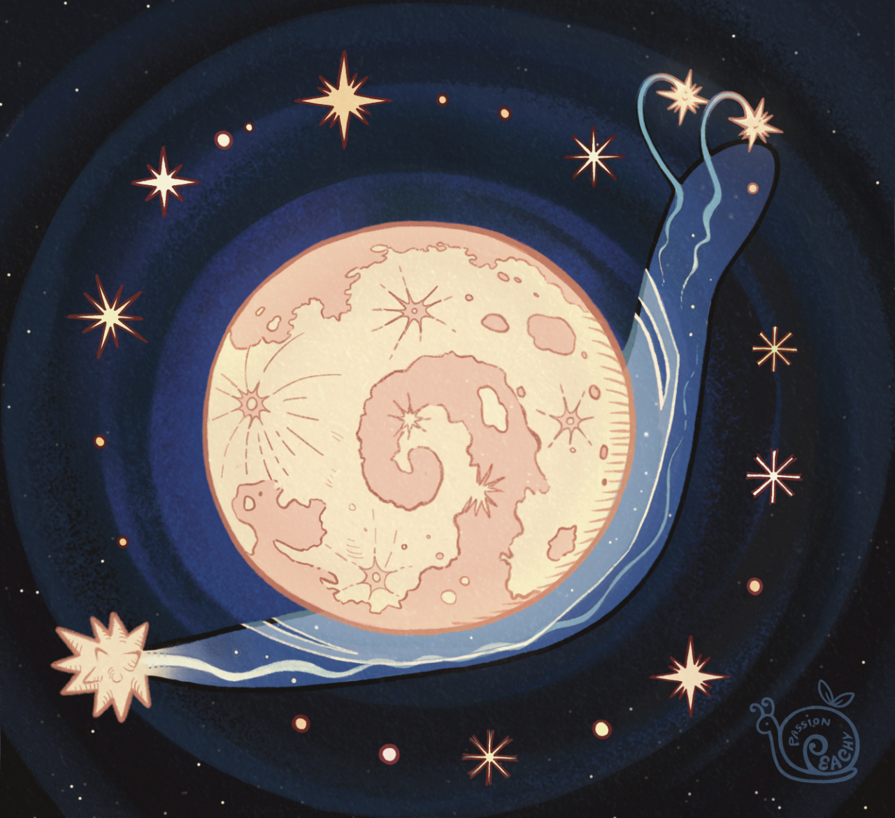
I really like ur oracle of the moon card, what materials did you use? I haven't figured out yet what media I should use, the cards' matte texture isn't something I typically draw on
It was something I went back and forth on because the cards don’t have the absorbent quality that most drawing paper does, so I knew it would be tricky. I did a light sketch in pencil, and then I thought I would try doing the background at least in alcohol markers to test how well it worked. I was surprised to see that, unable to fully sink into the paper, it kind of defused like watercolor instead of streaking like marker, and gave it a fuzzy, blendable quality I kind of liked. One thing I quickly noticed though was that while the marker was still wet, you could blend colors very well, but if you put another color on top after it it dried, it would pull up the color underneath.
Funnily enough, I used this limitation to my advantage and used it to highlight and blend, and it actually looked great on the sense of depth and space in the beacon. The ironic part is, that I fully intended to use acrylic paint, but at each new step, I experimentally tried marker first to see how it worked, telling myself I could paint over it if I messed up. (Though I will admit I was slightly hesitant to commit to acrylics if it came to that because it would make the card heavier and the texture distinct unless it was very thin paint).
I ended up doing the whole thing in alcohol marker (I used prismacolor and copics) and blocking out the colors and sections as I went, and I was most nervous about the skin tones and the gilded edges of the beacon because those needed to pop right and might’ve been more fit for acrylic—if it weren’t for the fact that the details were so tiny that I might have lost my mind if I had to do that with a brush. After I let the marker fully dry, I used liner pens for the outside, I used a .005 mm if you’re interested, and white gel pen for the stars. I would let the gel pen get a bit dry so some of the dots were far smaller than others, with just a couple fully pressed in dots for a few of the bigger stars.
In general, I’d probably recommend an acrylic based paint pen, like posca, or else a thin acrylic paint if you’ve got a tiny brush and steady hands, because then it won’t risk smudging as much or stripping away the color underneath if you apply a new layer. But it will give you a more opaque look. If you like the kind of blendy-transparent look and feel of watercolors, I would use alcohol marker and then just be careful how much you sweat on the card lol. Do not use actual watercolor on it though, it will warp and ruin your card, and the pigment will not absorb into the paper properly. 
Also thanks! I’m glad you liked my card! Please tag me if you end up making one of your own, I’d love to see it :)